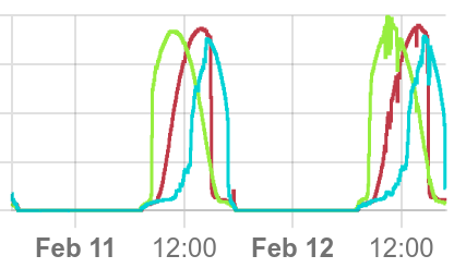
Something I’d like to see is multiple target graphs on a single plot.
Don’t worry about the specific quantities being graphed here, the point is that there are three different things that go up and down each day, and they’re all on the same graph, in different colors. It’d be nice to do this sort of thing with an observing list.
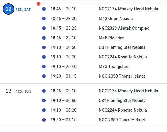
A second thing I’d like to see is something like a gantt chart, again showing my observing possibilities as kind of bar charts. I used stellarium to estimate my viewing tonight with respect to my local obstructions (trees, buildings) and plugged them into a google calendar as kind of an example…