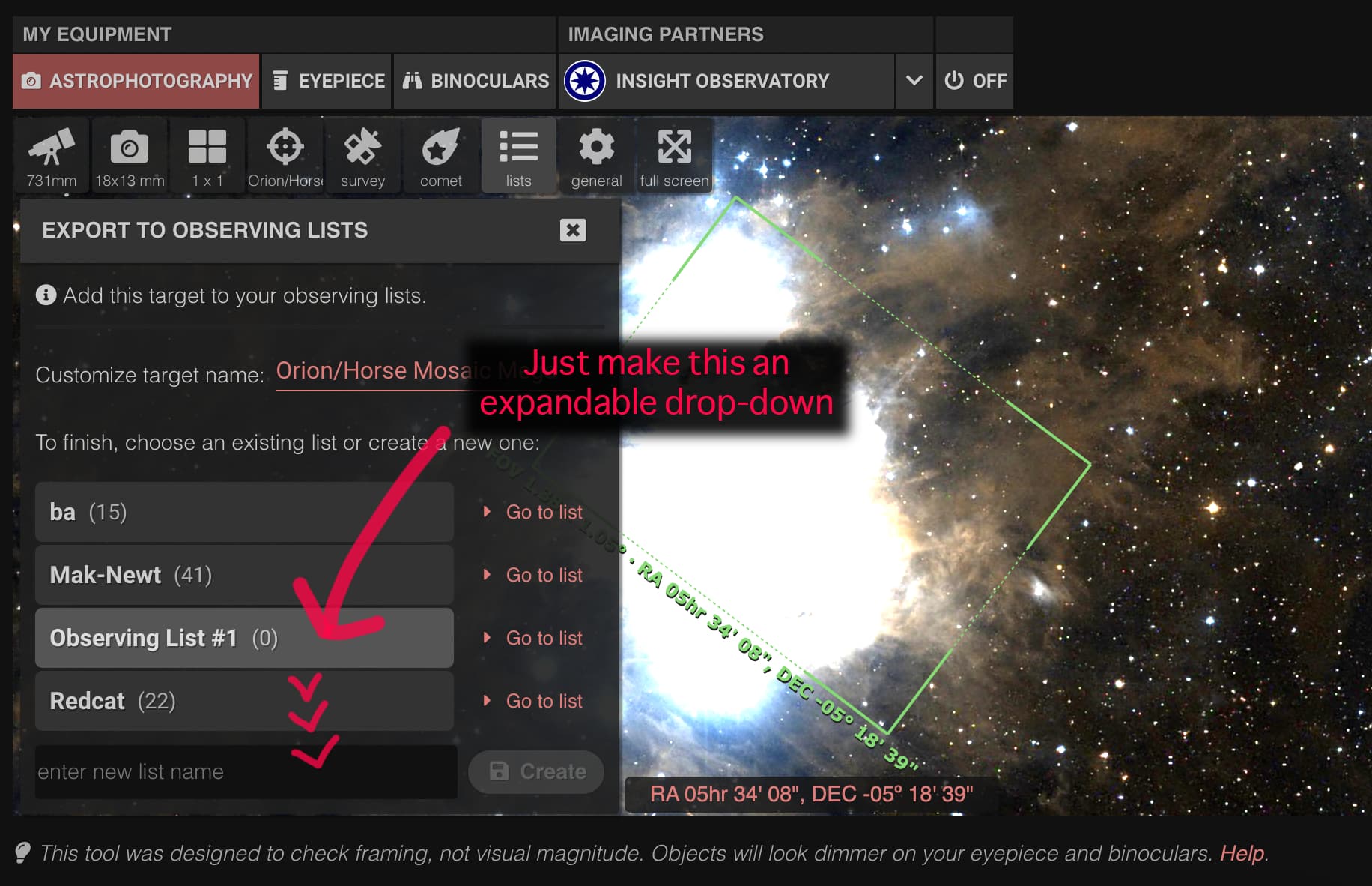
At present the observing list UX is a bit un-intuitive. Opening the observing lists box, shows a ‘list of lists’, but rather than expanding them, you have to click “go to list” to open another view, which then loads targets that open in another view.
Far better to just have a drop-down of targets that can be clicked through while maintaining the open list items.
Thank you for your suggestion @Barrington_Russell.
Could you please clarify the use case please? Why would you like to expand an entire list there? Maybe to check if you have already added this target? I’m asking this because maybe there could be a different approach to this, like showing an alert if you are about to add a duplicate target, or something like that.
That panel is meant to be a “list of lists”, as you said, so you can add targets to them. The “Go to list” link is there for convenience, but displaying the whole lists there never crossed my mind so maybe I’m missing something.